Why SEOs Need To Care About User Experience

As digital marketing has grown up over the last few years, disciplines like SEO have blurred so much that most of us no longer even know what to call ourselves.
There is a good reason for this – because Google have changed the rules so much that we’re not even playing the same game anymore.
As Google has continuously evolved, we’ve looked to adapt our practices in turn, to stay one step ahead of the game. At times, it has felt like SEOs Vs Google.
But Google isn’t interested in that debate.
Google Doesn’t Care About SEOs
Whilst we might like to think they do, Google really don’t give a shit what SEOs think. Yes, they want to stop spammy results from dominating the SERPs, but only because it ultimately affects one thing – their revenue.
This is why brands get slapped by penalties then reprieved 2 weeks later – because the search experience becomes worse for Google’s users.
This is also why we are at iteration 475 (something) of Panda and only iteration 3 of Penguin. It is more important for them to penalise bad search results than to stop SEOs from cheating their way to the top.
Google Only Care About Google’s Users
Google have been telling us for years that we need to care about users, this is directly from their Webmaster Guidelines:
“Google’s goal is to provide users with the most relevant results and a great user experience”
To rephrase this slightly; ‘Google’s goal is to provide users with the best experience of Google.’
Search is still Google’s core product, and their success is still directly tied to monetising search results. It’s in their best interest to serve the most satisfying content to their users.
For most of 2014, the SEO community has been waiting waiting waiting for the next Penguin update – and then when it arrived we were all disappointed by how little had changed. Whilst in the background, Google quietly got on with releasing update after update to help improve their bottom line.
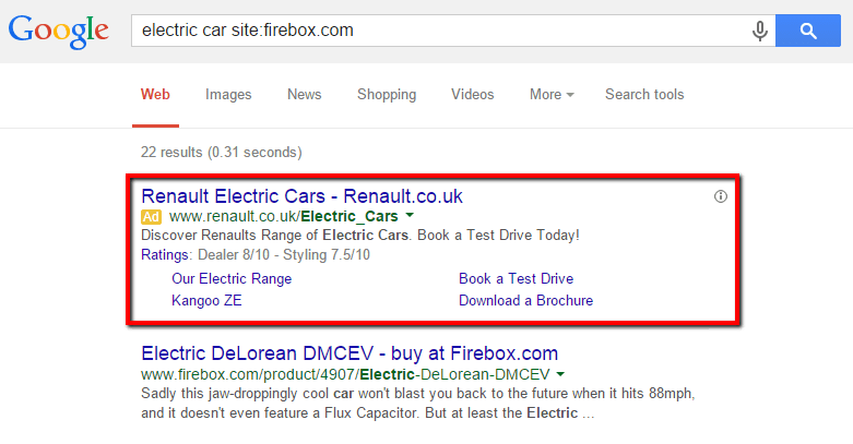
Here’s 9 things which have changed in the last 12 months which have nothing to do with backlinks, and everything to do with search experience.
#1 Can’t See The Ads For The Ads
Probably the clearest example of Google focusing on their post-click experience, the ‘Top Heavy‘ algorithm downgrades sites with too many distracting ads.
This algorithm updated again earlier this year, and Google gave a very clear statement of intent in their original announcement of the update:
“…we’ve heard complaints from users that if they click on a result and it’s difficult to find the actual content, they aren’t happy with the experience. Rather than scrolling down the page past a slew of ads, users want to see content right away.”
– Matt Cutts, Page layout algorithm improvement
Google doesn’t care how good your content is. If your site is littered with so many ads that it’s hard to even find the content, it reflects badly on Google’s Search Experience.
#2 Hidden Content = Potentially Bad Search Experience
While the top-heavy update felt quite easy to anticipate, this one has come as a bit of a shock: Search Engine Roundtable published a post the other day picking up on a WebmasterWorld comment from a webmaster that Google are no longer indexing content in their “read more” panels that are hidden during the “onLoad” event.
In fact, Barry followed this up by asking John Mueller about it in a Webmaster Central Hangout:
We all know that some SEOs have abused “read more” tabs, using them to pump in keyword rich content purely for Google, but hiding it so most users won’t be distracted by it. Perhaps some SEOs will therefore view this move as an attack by Google on SEOs trying to game the system.
But I don’t think this is anything to do with it.
Web designers may also argue that tabbed menus improve user experience (and maybe they are right).
But this isn’t anything to do with it either.
Google’s standpoint is simple to understand – they don’t want users searching for something, seeing the text display in the description snippet, then failing to find it when they visit the page.
This would result in a poor Google Search Experience.
This is actually both about the pre-click and the post-click experience, and ties in with the CRO principle of ‘scent‘.
Whether the tabs do offer a user good experience is up for debate, but if they potentially offer a bad Google Experience you better believe they’re going to do something about it.
From a usability perspective, you do have to ask yourself, ‘why is the content hidden in the first place?’
Because it is less useful content.
You have other content, which is more useful, which you have decided to show your visitors first. As John puts it in the video:
“Not all elements within a page are equally relevant”
What Do Amazon Do?
I know it is often a fool’s errand to compare yourself to the likes of Amazon, but one thing you know for sure is that they test the shit out of their user experience. And this is a usability issue.
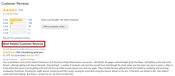
They have 731 reviews of this book – that’s a shitload of unique and relevant content. Instead of choosing to display all of it, or hiding it away in tabs, they display the 8 reviews which their users have deemed ‘most helpful.’
This is a solution to the usability question ‘what content is most relevant to my users?’
If Google start to roll out this change more comprehensively, you may need to answer this question about your content as well. As John ominously put it;
“If you want that content visible I’d make sure it’s visible for the users“.
#3 Panda’s Engagement Factors
Panda has a reputation for being an algorithm that penalises duplicate or thin content. Whilst this is undoubtedly true, it doesn’t accurately reflect what Google were trying to do with Panda.
“…the key is, you also have your experience of the sorts of sites that are going to be adding value for users versus not adding value for users. And we actually came up with a classifier to say, okay, IRS or Wikipedia or New York Times is over on this side, and the low-quality sites are over on this side. And you can really see mathematical reasons …”
– Matt Cutts, Wired interview 2011
This was right after the first Panda update (which was very obviously aimed at content farms), and it shows how Google are benchmarking sites against one another. The only realistic thing they could be benchmarking to give ‘mathematical reasons’ is engagement metrics.
In my experience, the engagement ‘dial’ was turned up when Google released Panda 4.0. Having said that, Panda experts like Glenn Gabe have been beating their drums for years about engagement being key to understanding Panda. Here is an example he shared on Search Engine Watch recently:
This was a site with only 40 pages indexed, yet ranking for thousands of keywords – many which of were a poor match for searchers. Their traffic was cut in half when Panda 4.0 hit, because the irrelevant rankings led to poor engagement and a poor experience of Google.
Case In Point
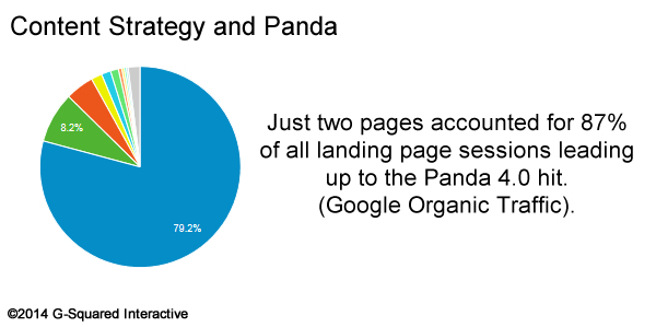
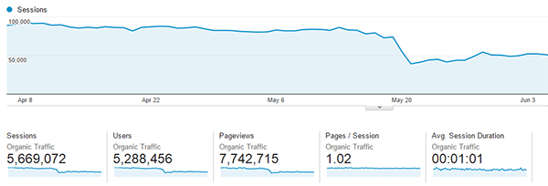
Here is another example, one I worked on a few months ago – a site which had ranked incredibly well for a number of high volume keywords for years. Their site worked by attracting people in, then immediately siphoning them off to an external site to purchase their product. They saw a huge drop in organic traffic when Panda 4.0 hit.
When I audited the site, there were no issues with duplicate content or thin content, but they had extremely poor engagement metrics – no one was looking at more than 1 page of content. This was the red Panda flag.
If all of their visitors were landing on their site and then shooting straight off it to somewhere else, how are they ‘adding value for users’?
Google is looking at this stuff and seeing a site that does not satisfy the searcher, and adjusting the SERPs accordingly.
#4 Site Speed as a Ranking Factor
The phrase “Site Speed as a Ranking Factor” must be one of the most overused phrases in the SEO industry.
This is mainly because of 2 things:
- Google told us it is a ranking factor
- It is pretty easy to measure and report on (if not always actually fix)
Beyond telling us that site speed is a ranking factor, Google also told us why:
“Speeding up websites is important — not just to site owners, but to all Internet users. Faster sites create happy users and we’ve seen in our internal studies that when a site responds slowly, visitors spend less time there.”
– Amit Singhal & Matt Cutts, Using site speed in web search ranking
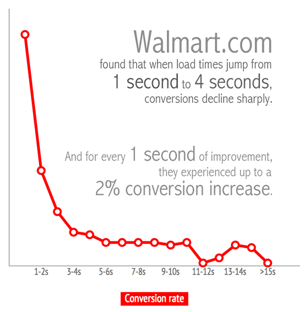
Visitors spend less time there = Poor(er) engagement. As we have seen from looking at Panda above, engagement is kinda a big deal.
Everybody Agrees That a Faster Site Is Better
We live in an age where speed is king – Wi-Fi, fibre-optic broadband, 4G – the list goes on.
Faster websites make for a better experience: it is intuitively so, obviously so and demonstrably so.
Google Now Want To Load Pages Before You’ve Even Clicked On Them
Google care so much about speed, they have developed an experimental feature in Chrome which allows them to predict which search result you will probably click on and ‘prerender‘ the content before you’ve even clicked it.
This loads the content much quicker than before, resulting in an improved experience for the users. Groupon noticed this recently playing havoc with their in-house analytics software:
Google clearly care about speed and the impact it has on user experience. They don’t want to send users to slow websites, as there is a greater chance they will be dissatisfied with the result – which makes them less satisfied with the search experience itself.
#5 Sitelinks Search Box
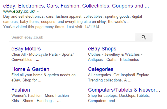
Sitelinks have been around for years, offering additional links underneath a domain/subdomain to prominent or popular pages within the same site.
As these appear for branded queries, it is pretty clear that Google were trying to help users beyond their initial navigational query, to reduce the work required when they landed on the site.
The latest change, announced in September this year, takes this one stage further, with an improved sitelinks search box that will actually jump the user directly into search results on your website.
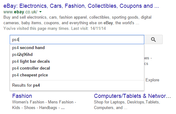
This change bumps the site search box (which previously appeared below the sitelinks) above all the sitelinks so it is right underneath the main result. It also enables autocomplete:
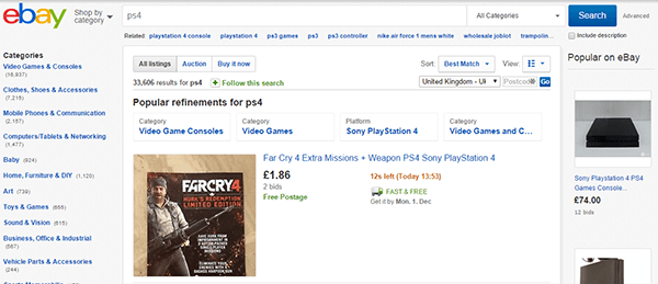
But the really interesting change is that this search will now send you directly into the search results from the website itself, which in my example looks like this:
Undeniably that makes for a better user experience – both in terms of the search experience and for the usability of the website itself. In order for this to work, however, you need to add some additional markup to your site.
A failure to do this means that the search result is instead generated using a site: operator. AJ Kohn recently published an article criticising the speed with which this has been rolled out, arguing that many sites would likely fail to implement the schema markup required, and be left with the site: search results – which also show Adwords results and could result in lost clicks.
My testing is a couple of months further down the line, but it was still pretty easy to find ecommerce sites that have the site search sitelink, and have yet to implement the markup. However, unlike AJ back in September, I found it difficult to get ads to come up, although eventually some did.
It is not yet clear to what extent Google has dealt with the Adwords issue, but possibly they have taken some action. Either way it certainly seems to be a step towards a better user experience all round.
#6 Google Put Mobile First
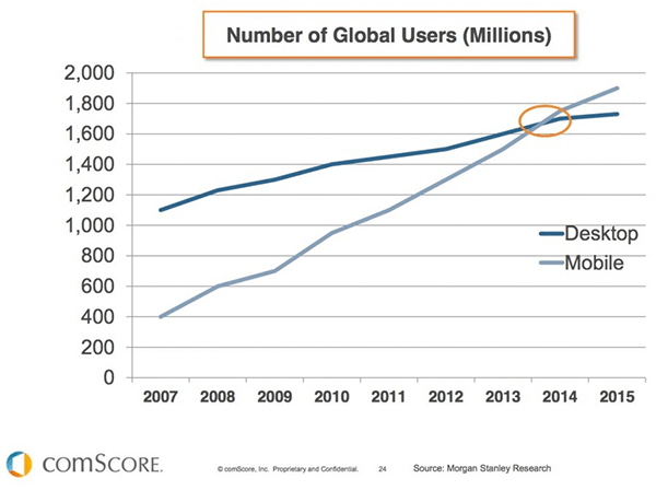
We’ve seen various predictions over the last few years about how mobile internet usage will overtake that of the desktop. Well, they now seem to be coming true.
From Google’s perspective, however, the more important trend is how quickly mobile search queries will surpass desktop queries, which they seem to think is coming pretty soon.
Mobile Friendly Sites
Google announced over a year ago that they would start penalising sites that offer a poor mobile experience.
“To improve the search experience for smartphone users and address their pain points, we plan to roll out several ranking changes in the near future that address sites that are misconfigured for smartphone users.”
– Yoshikiyo Kato & Pierre Far, Changes in rankings of smartphone search results
This made sense. I for one can’t remember a more frustrating search experience than a mobile search result for a deep page that redirects to the mobile homepage.
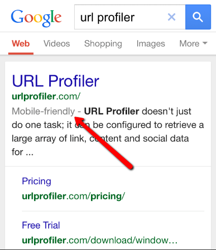
They have taken this to the next level, with a recent change that labels mobile-friendly sites, as – you guessed it – “Mobile-friendly.”
In the blog post where they announced this change, Google also suggested that they are “experimenting with using the mobile-friendly criteria as a ranking signal”. When pushed by Search Engine Land on whether mobile UX might become a ranking signal, a Google spokesperson apparently responded:
This statement makes two clear points:
- They want to push webmasters to improve user experience
- They are focused on mobile search at least as much as desktop
Taking the second point further, Dr Pete Meyers, in one of his trademark breakdown posts on Moz, suggested that now, “most of Google’s design decisions are being driven more and more by mobile devices.”
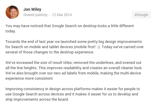
This was confirmed officially when Google’s lead search designer Jon Wiley announced the roll-out on Google+:
Panda + Mobile Engagement
As we saw above, poor engagement can prove a massive factor when it comes to Panda. With mobile becoming an increasing portion of website traffic for most sites, it follows that engagement from mobile is something worth being concerned about.
Glenn Gabe (yes, the Panda expert – and yes, again) put this very eloquently in an article on Search Engine Watch:
“So, if Google’s Panda algorithm is measuring user experience, and your site gets 50 percent of its visits from mobile, then that means 50 percent of those Panda metrics are from mobile users. I’ll give you a second to read that last line again. Yes, half of the data Google has access to while analyzing your site from a Panda standpoint would be from mobile users.”
The message is clear – if you want to succeed in mobile search, you need to care about the mobile experience of your users.
#7 Reduced Rich Snippets
We know Google is conscious about offering a consistent search experience across devices, and in many cases is designing ‘mobile first’. Therefore we probably shouldn’t be surprised that some of the visual clutter caused by rich snippets has slowly but surely been stripped back.
Over the past few months, we have seen various rich snippets change dramatically:
- Author photos disappearing completely from search results (after initially being reduced)
- Video snippets being removed for (practically) any site that isn’t YouTube
- Review stars being suppressed
But for some searches, Google are still displaying very visual and complex rich snippets.
What gives?
To get a much better understanding of what’s going on, I suggest you read AJ Kohn’s tumble down the rich snippet rabbit hole in his superb post Algorithm Inception: Inside The Rich Snippets Algorithm.
For the sake of brevity, here are some of AJ’s key findings:
- There’s a rich snippets algorithm within the main search algorithm (à la Inception)
- This algorithm takes site quality into consideration – rich snippets changing in lockstep with Panda
- Query syntax and intent influences which visual elements are displayed
- Rich snippets are heavily linked to Knowledge Panels, which sometimes replace rich snippets
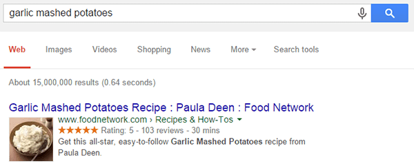
That should be enough of a taster to inspire you to take a time-out to read AJ’s post if you haven’t already done so. It also helps explain our recipe result above – through analysing the query syntax, Google has correctly guessed I’m looking for a recipe, and displayed 3 of the most important things I might be interested in (What does it look like? Is it nice? How long does it take?).
Notice they are no longer showing number of calories (or is that a reflection on me…?)
The disappearance of Authorship
Once hailed as a replacement for PageRank, the complete abandonment of Authorship snippets in August this year marked a significant fall from grace. In his initial announcement about the depreciation of Authorship snippets, John Mueller stated the following (emphasis mine):
“We’ve been doing lots of work to clean up the visual design of our search results, in particular creating a better mobile experience and a more consistent design across devices. As a part of this, we’re simplifying the way authorship is shown in mobile and desktop search results, removing the profile photo and circle count. (Our experiments indicate that click-through behavior on this new less-cluttered design is similar to the previous one.)”
This chimes with a lot of the other things we are seeing – and makes the important point that they saw very little difference in click-through behaviour.
Eric Enge and Mark Traphagen also noted how poorly the markup was adopted, which likely also had some impact on the decision.
#8 Answer Boxes
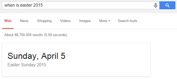
We’ve seen how Google is using query intent to determine the design configuration of the search results, and with Answer Boxes they take this to the logical extreme.
By understanding the meaning of the query, Google is able to ascertain if a question is being asked, and wherever possible serving an answer to this question directly in the search results. In examples such as this, the search experience is unquestionably (get it?) improved by the answer box.
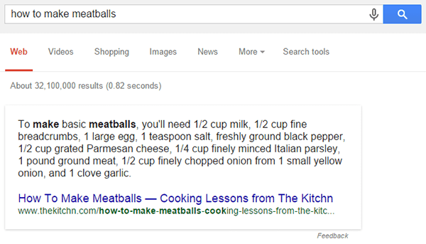
Most questions, however, have less definite answers…
Personally I think these type of ‘answers’ are much less helpful – this is just a list of ingredients, it doesn’t actually tell you ‘how to’ do anything. As we have seen countless times over the years, Google will experiment with different variations and drop any they think don’t add value (I’d certainly like to see these ones gone).
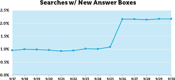
Dr Pete, using his Mozcast Feature Graph, detected a 98% jump in these newer ‘attributed’ answer boxes (with the search result inside the answer card) at the start of October:
We have seen with Hummingbird that Google are committed to understanding searcher intent, and this understanding will only improve as they learn more about entities and associations. Of course, we can help them understand our content better using structured markup and helping answer the questions our target audience are asking.
Whether these ‘scraped’ Answer Boxes do indeed improve the search experience is currently unclear, what is clear is that Google are prepared to iterate the search experience so that it doesn’t even need a click.
#9 Knowledge Graph
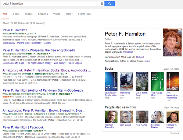
When Google do recognise entities within a search query that they are familiar with, they may also display associated data from their Knowledge Graph, in a panel alongside the search results.
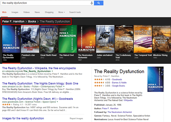
The additional context this offers the searcher allows them to confirm (or not) that they have found what they were looking for, potentially answer follow-on queries without having to ask them, and deep dive into related queries by exploring the collated results. For example, clicking through to ‘The Reality Dysfunction’ offers a rich follow-on result:
Note the highlighted breadcrumb trail, which is a very recent addition. In this example, I can use the breadcrumb links to jump back up a level of two, or click into any of the book titles for a Knowledge Panel on each one.
Knowledge Graph results are all about context. As Google gets better at understanding context, they in turn will be better equipped to offer their users more context, in order to make better selections, resulting in an improved search experience all round.
Search Experience – Where Usability and SEO Collide
In the last few years SEOs have faced an identity crisis. We know that this is not a sufficient definition:
Source: Searchengineland
We can’t bury our heads in the sand and pretend that SEO is still just about ‘getting traffic.’
It’s about getting the right user traffic, and engaging these users with content that satisfies their objectives – it’s about their experience of your website via the search engines.
Optimising The Experience
Google are optimising for user experience. And websites that offer a poor user experience can’t expect to get rewarded by Google. Whether Google identify this through thin content, duplicate content, deceptive tactics or poor engagement, it is the user experience that counts.
But it’s not the experience of your website that they care about.
It’s the search experience they care about. The experience of searching for something, then finding an informative and engaging result that matches what was searched for.
We need to understand what the search experience looks like for different pages on our site, and different segments of our audience – both qualitatively and quantitatively. Only then can we start to appreciate the various opportunities and threats that are present, and what we can do to make the most of them.
Maybe this needs to happen in 2015, maybe not. Either way round Google will continue to optimise for their users, so the sooner we accept this, the sooner we can start optimising the experience.


