25,000 Reasons Why You Don’t Have a Mobile-Friendly Tag
Ok, I lied. It’s actually only 5 reasons. BUT I did look at 25,000 sites in the process…
As we’ve all been told, Google plan to wreak havoc with the mobile SERPs, starting next Tuesday.
You can avoid this drama by having a mobile-optimised site, and obtaining a nice ‘mobile-friendly’ tag from Google in the search results.
But what helps you gain this vaunted status, and what causes failure? That’s what we set to find out.
Google use 5 key usability tests to determine whether a site will pass the mobile-friendly test. Some of these tests are more important than others, and some of the tests only have an impact in extreme cases.
Testing 25,000 URLs
I tested 25,000 random(ish) URLs to try and figure out how we can interpret these usability tests and translate them into simple rules of thumb – which were tested by running the URLs through URL Profiler’s new mobile-friendly checker.
The sample URLs were not scientifically collected. I merely combined a range of random Google scrapes with some link profiles and a smattering of sites from the Majestic Million. Just like Ian Lurie’s findings, about 40% of the URLs tested actually failed the mobile-friendly test.
If you want to have a look at the data yourself, you can download a copy of the results here.
Honest Admission: I must preface this post with an open admission of failure. This is the 3rd time I have written this post. The first 2 attempts were spent trying to find absolute patterns in the data. This was along the lines of ‘font size is all you need to get right for mobile’. But it turns out that the mobile-friendly rules are simply not that black and white.
Instead, this post will try to separate the grey from the… greyer.
What do we know?
Let’s start with what we know:
April 21st. That’s the day Google will begin rolling out their new mobile-friendly algorithm. According to Google, if your webpages are not mobile-friendly, they may not rank as well in mobile search.
Whilst we don’t know exactly how much impact it will have, here are some of the things we do know:
- The algorithm will work on a page by page basis (i.e. at URL level, not domain level).
- The algorithm will roll out worldwide, and may take up to a week to complete rolling out.
- It is a yes/no factor – you are either mobile-friendly, or you are not.
In this post we will help reveal some of the more intricate details of why pages are being classed as mobile-friendly. Or more importantly – why not.
Is my site mobile-friendly??
This is how Google tell you to check if your webpages are mobile-friendly (source):
Or, you could use Google’s Mobile-Friendly Test page:
But these methods only check one URL at a time, so you’d have to do this for every page on your site. We recently added a feature to URL Profiler to do this in bulk, allowing you to import every page from your site and do a mobile-friendly check on each URL.
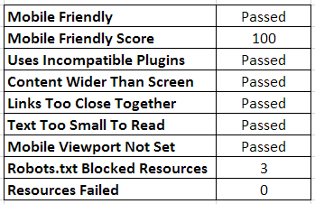
This is the data we give back, per URL: –
(Note: I don’t normally do this with my screenshots, but for ease of viewing I have transposed the rows/columns; this usually runs left-right)
This is taken directly from the brand new Mobile-friendly API (in beta) and not from Google PageSpeed Insights.
One thing worth noting is that our homepage does block 3 resources (external plugins) and this does not cause the test to fail – more on this later on.
But what if my site isn’t mobile-friendly?
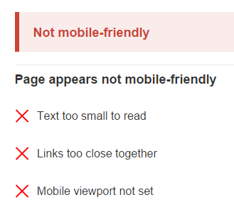
If your site isn’t mobile-friendly, you’re going to get this sort of result upon testing one of your URLs:
If you want more detail on these ‘hints’ on what to fix, Google send you off to the PageSpeed Insights page and the Mobile Usability results.
The tests that they want you to pass translate into the following 5 “rules”:
- Uses Incompatible Plugins – don’t use plugins that most mobile browsers don’t support, like Flash or Silverlight
- Content Wider Than Screen – make sure content fits within the viewport, so there is no horizontal scroll
- Links Too Close Together – make sure your links/buttons are easy for mobile users to press
- Text Too Small To Read – make sure your font is big enough for mobile users to read
- Mobile Viewport Not Set – make sure that your page specifies a viewport, or adapts to different devices
Having examined these rules in action across 25,000 different URLs, I have developed these rules into 5 simple mobile lessons:
Mobile Lesson #1: Incompatible plugins = NO!
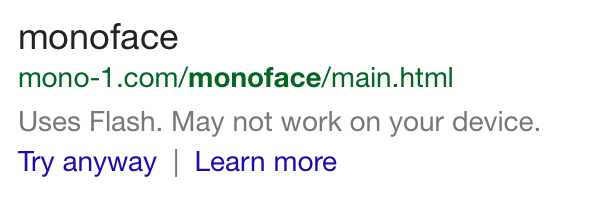
An absolute no-no this one. If you have incompatible plugins on a webpage it is not going to be classed as mobile-friendly. Heck, it’s not even a fair fight…
Never mind ‘mobile friendly’, they flat out don’t want to show the content.
TL:DR: If you’re using Flash on your site…stop.
…unless it’s YouTube
I actually found a small pocket of sites which passed the mobile-friendly test, and passed every other test EXCEPT for ‘incompatible plugins’. My interest immediately piqued, knowing how strict Google normally are against this. Why did these few sites not also fail?
Looking a little deeper, I noticed that all of these sites were using the old Flash YouTube embeds. This is what the Mobile-Friendly test listed as an issue, and PageSpeed Insights outlined as needing to be fixed:
The videos do work on mobile (YouTube provide alternative players) so I guess this does make sense from a user experience perspective. Could it just be Google giving YouTube special treatment? Wouldn’t be the first time…
UPDATE:
Google effectively confirmed this is what is happening in this update post (point 11):
Mobile Lesson #2: Content width – It’s all about that bass
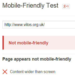
This is an interesting one. When we were initially checking, we found so many examples of pages being classed as mobile-friendly despite failing this test, that we were sure it wasn’t an important factor.
However, with the 25k list it was easy to find counter-examples (with a few Excel filters):
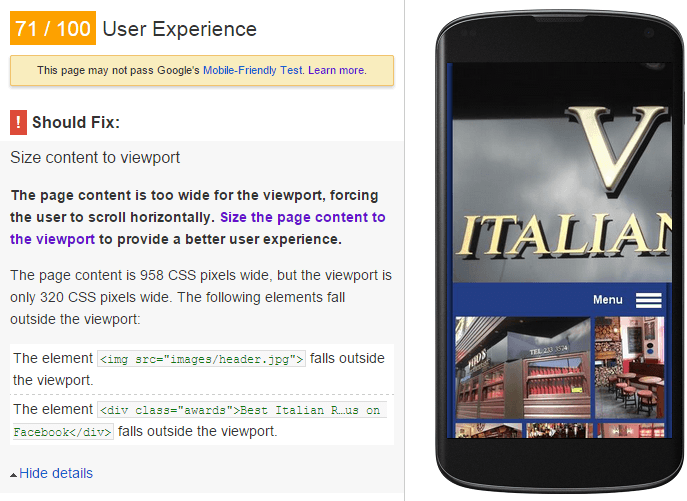
Google’s PageSpeed Insights section on mobile user experience helps shed some light as to why:
In this instance, they’ve done almost everything right – they actually do have a mobile site with a specified viewport. However the header image has been set to an exact width and does not scale, so it has ended up 3 sizes too big.
Here’s another example, a website with a mobile friendly theme, yet on this particular page they have a table embedded which is a lot wider than the rest of the content.
If this happens to be a very popular page for the site, they could be in for a nasty shock come April 21st.
This sort of thing could easily slip under the radar, which is why it is imperative that all important search pages are checked individually.
However – most cases are not so bad
We also found over 3000 cases where the page failed on the test for ‘Content Wider Than Screen’, but was still passed as mobile-friendly (versus only 75 that failed purely on this criterion).
What we are seeing here is that, in most cases, Google don’t mind if the content doesn’t fit perfectly, but in extreme cases they will penalise you for it. In fact, we noticed that the Mobile-friendly API will give you a ‘Fail’ for this test even if you are 1 pixel out!
TL;DR: Make sure your pages are not carrying a wide load.
Mobile Lesson #3: Links too close? Google don’t care (except for when they do).
From our test dataset, we saw 10,500 pages fail the test ‘Links Too Close Together’ yet still get the Mobile-Friendly tag. Of all the mobile UX factors, it seems to be the one Google care least about.
When I discussed this with Gareth (while he was wearing his web-designer hat), his response was:
“Yeah that makes sense, cos it’s a right pain in the arse to implement.”
Eloquent.
As per Googual, it couldn’t possibly be a factor that they just ignored completely, which would make everyone’s life easier. As with the content width example above, this one again comes down to extremes. For example, Wikipedia’s generic homepage fails on account of links being too close together.
The reality seems to be that they just have way too many of them that are close together. Fortunately for Wikipedia, they already have a mobile version of the site which Google display first anyway (but this might be something to consider from an ORM standpoint).
Here’s another example below. This guy has a site which is responsive, and classed as ‘mobile-friendly’ most of the time (until, that is, he decided to make a list about everything).
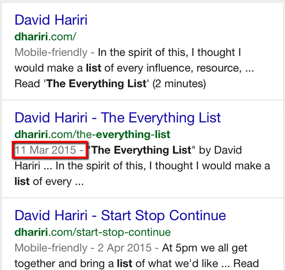 By the way, I wasn’t trying to highlight the presence of the date snippet; rather, the absence of the Mobile-friendly tag (just in case that wasn’t obvious…).
TL;DR – don’t make massive fucking lists of links.
Mobile Lesson #4: Size is everything
This one is a biggie. If you screw this one up, then 98.5% of the time (according to our results), Google are going to slap a big fat NOT MOBILE FRIENDLY tag on you.
Well. Actually they are not going to slap any tag on you. It is in fact the absence of a tag that is important (but my version was much more dramatic).
Anyway, most of the time, small text = shit mobile experience = no mobile-friendly tag for you.
Illegible! Not a mobile-friendly tag in sight.
This page from Ranker provides a counter-example, this page passes the mobile-friendly test, yet fails on font legibility. According to PageSpeed Insights, all the ‘cast’ text only renders 8 pixels tall.
(By the way, The Fifth Element ranked higher than Looper – who votes on this thing??)
Here’s another example:
All the examples I could find exhibited the same thing – the text which was highlighted as ‘too small’ was supplementary text – short tags or lists, never proper sentences or ‘body copy.’
I don’t have enough evidence to say what the threshold is one way or another, but you certainly can get a mobile-friendly tag even if some of your fonts are too small.
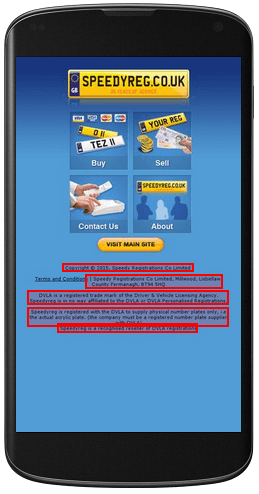
The example below is the same thing but in reverse – this page has a mobile version they send mobile traffic to. Since there is barely any content on the page, the T & Cs end up as the main body content, and as the font is too small, it fails the mobile-friendly test.
TL;DR – as a minimum, make sure your main page content uses a legible font size
Mobile Lesson #5: Size is everything (hang on??)
Font size is also dependent on the viewport settings, which control how a webpage is displayed on a mobile device.
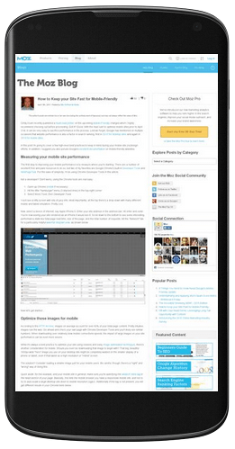
A page without a properly configured viewport will be rendered in a desktop browser at a typical desktop screen width, scaled down to fit the screen – often resulting in text being way too small to read.
What Moz are ably demonstrating is the most intuitively obvious example of a web page that is not mobile-friendly. Pinch-zoom, read, scroll right, read, pinch, zoom, scroll, read…
It’s just about the text legibility
Despite being obviously related to text legibility, the mobile viewport is not a crucial factor in it’s own right. In fact, every single instance we found where mobile viewport was the only test failed, the site was still classed as mobile-friendly.
We also found hundreds of examples of webpages failing the viewport test (and other tests), yet still getting the mobile-friendly tag.
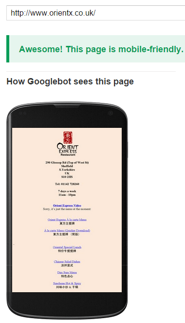
Consider this website, which in a desktop browser looks like this:
It is a simple one page site with a few links to PDF menus. It doesn’t do anything fancy in the slightest, but has a sufficiently large font that when it is scaled down for mobile, it is still readable:
What this shows is that you don’t need to have an all singing, all dancing, fully responsive website in order to be classed as ‘mobile-friendly’.
Here is another common message we saw, for those ‘failing’ the viewport test:
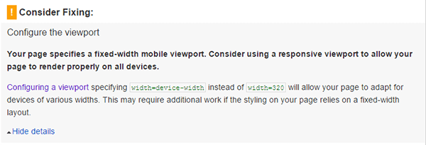 A bit picky. Clearly the site is trying to do a good job for mobile. At least Google are not actually penalising them – at least not yet.
TL;DR – see Mobile Rule #4
Bonus Mobile Lesson #6: Robots.txt can fuck up EVERYTHING
I know what you’ve all been thinking as you’ve been enjoying this tour de mobile:
“WHAT ABOUT ROBOTS.TXT??”
Currently, Google is assigning the ‘Mobile-friendly’ tag to sites which pass their test. As we have seen above, at the moment this is based largely on using legible fonts and avoiding Flash plugins.
However, in some instances, it just so happens that some CSS or Javascript resources are being blocked by robots.txt, such that the page may not look mobile-friendly to Googlebot (even if it actually is to users).
Here is an example, a site called ‘Demochimp‘, which fails the mobile-friendly test:
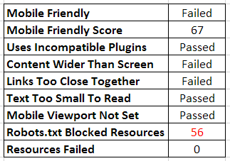
From the URL Profiler export (again transposed to save your eyes), this looks like:
But here’s the rub: they do have a responsive website.
In fact, if you go and check this out on Mobile PageSpeed Insights you will see it gets a 100% Usability score. This reflects the issue with PageSpeed Insights which you may have seen Alan Bleiweiss ranting about recently.
So the important issues are NOT the content width or the links being too close together, but the blocked resources at the bottom.
When you examine this site, you can see that their robots.txt file is blocking various style sheets and Javascript files (see the red ‘Robots.txt Blocked Resources’ at the bottom of the table).
This means there is a disconnect between how Googlebot sees the page and how users see it:
Because Googlebot can’t crawl some of the resource files, they see the page as having content far wider than the screen, which looks like a terrible user experience.
As a result, Google do not grant the ‘mobile-friendly’ tag, and this site could be facing a major rankings drop when the update rolls out.
It is very important to note that you may well be blocking resources that have nothing to do with how the page renders (such as 3rd party plugins) – so you only need to worry about blocked resources if you are failing the mobile-friendly test.
However, this whole thing could mean that many sites in a similar position think they have a mobile friendly design, and may be shocked to find their rankings slip come April 21st if Google disagrees with them.
TL;DR – make sure your robots.txt file is not screwing over your mobile-friendly website.
This will mostly have you covered…mostly
This post hopefully offers a little more context to the mobile ‘rules’ which Google have defined, and, more importantly, demonstrate how they can trip you up even when you think you’ve got it nailed.
As for my lessons, I guess it’s fair to say they will work most of the time.
One thing remains painfully evident – you can’t take anything for granted. You could have a beautiful, responsive theme, which is being completely undermined by an unresponsive embed.
Any site with a CMS and multiple editors, or a high level of user-generated content, will need to be extra careful – even a single image can break this thing, or a single line on robots.txt.
If you want to be sure that every page on your site is mobile friendly, you need to check every page. And regularly at that.

